Saturday, 29 October 2011

RM - Ramsay MacFarlane

The personal business card of talented freelance designer, Ramsay MacFarlane, is a fusion of classic design and modern flair. In Ramsay's own words, "as people increasingly stare at pixels on a screen, printed promotions can have a more personal and lasting impression.As well as graphic design, material choice and printing methods are equally important in creating print; from business cards and product packaging." All sentiments with which we would heartily agree.
Stock is a heavy duplex 700gsm of Colorplan pristine white and ebony. We letterpress printed in dense black ink to the white side and foiled Ramsay's signature logo in glossy black foil.

Wednesday, 26 October 2011

A Wooden Tree

Creativity is abounding in this beauty, designed by Adam Wilson of fourcolourblack for textile artist Kirsty Anderson of A Wooden Tree. Now, your delectable purchases will be enhanced by a lovely personalised swing tag.
A very thoughtful choice of stock made this a pleasure to print. Cairn Board is recycled stock made from 100% pre-consumer waste and as can be seen at 700micron, gives a deep, crisp impression. It's available from Paperback in a nice range of colours - this one is Almond. We mixed a rich brown ink and letterpress printed before drilling the hole in the tag.

Thursday, 20 October 2011

All That Jazz; Award Winner

 "The 2011 Chairman's Award for Design goes to Glad for Nottingham Jazz Business Card."

An excellent result for Glad Creative, with whom we've had the pleasure of working on a number of pieces, including the award winning business card for Nottingham Jazz at the recent Roses Design Awards.
The prestigious Chairman's Award demands high standards on every count. Chairman Jack Renwick said "this was the piece that I remembered most throughout the day's judging ... the choice of stock was the icing on the cake."
And the stock was . . Colorplan by GF Smith, Mid Green at 540gsm weight. The face of the card has a buckram emboss and the reverse is a plain finish.
We letterpress printed the business card in black ink on a Heidelberg Platen to the strains of Duke Ellington on the gramophone, of course.

Tuesday, 27 September 2011

Printers' Pie part 1

Dan Snr. of Glasgow Press writes, I admit to having a weakness for pies – Scotch, steak, macaroni, apple, rhubarb, gooseberry, raspberry, cherry – yes, you've got it, give me anything encrusted in a nice-tasting pastry and I am hooked! So, last week I was in heaven when I heard our neighbour had given us four 'buckets' full of 'pie'  in which I could indulge myself.

For an explanation we need to go back to pre-computer days – the 1940s and beyond: I was an apprentice compositor with a company called Gilmour&Dean, of Fordneuk Street, Bridgeton, Glasgow. It was a fairly-big outfit who did quality colour work and had 'quality' customers, including a few large carpet manufacturers (who needed colourful, patterned carpet leaflets). G&D also printed for India Tyres, Babcock&Wilcox, and so on.

As an apprentice you'd be given the job of 'dissing' (distributing) Founders' type back into the proper box of the proper case. Founders' type was bought in from the typesetters, as against that produced in-house, e.g. linotype or monotype which would be melted down after printing, and re-used.

When 'dissing', you had to know the layout of the typecase, and be sure that the typeface and size matched what was already in the case, before 'dissing' the job.
Printers' Pie would come about if there was a mix of different fonts in the case or, more spectacularly, if you pulled a typecase out of a frame too far and spilled the contents onto the floor.

Caserooms were generally 'library-like' quiet, and a case of type spilling was not something that could go unnoticed. I don't recall this happening too often – but when it did, there would be loud cheering and jeering and stamping of feet from the unsympathetic fellow compositors – and even louder and more sensational if they learned that it was a case of 6-point Spartan.
Our foreman, who suffered from ulcers and had a perpetual worried look on his face, would be quick to try and calm the situation before the works' manager should happen past.
So, this is Printers' Pie; the result of an upset case (which might take a month to put right), or it may be a 'galley' of type going the same way as the case – scattering across the floor. Which leads me on to my four buckets of Printers' Pie – not for eating – but, strangely enough, something which I found very satisfying.

I enjoyed the nostalgia of going back to the 'setting-stick in hand' days and the dusty, real-feel of lead-type as against 'knocking-out' letters on a computer keyboard.
Wonderful as the computer may be, and is, there is nothing like a bit of Printers' Pie to cheer up the day.

Friday, 16 September 2011

Tasting Notes

Whisky Tasting Notes are always a delight to typeset. We especially love the enchanting, lyrical quality of those from Bruichladdich Distillery on the Isle of Islay.

Their Celtic Heartland bottlings are described in this special card which we foil blocked in silver onto Plike.
Plike is a unique range of paper and board from Italywith the unusual surface texture of rubber.

Would you like to have a sample? Then, please e-mail or message us and we'll send one to you . . sorry, just the card, not the whisky.


Monday, 12 September 2011

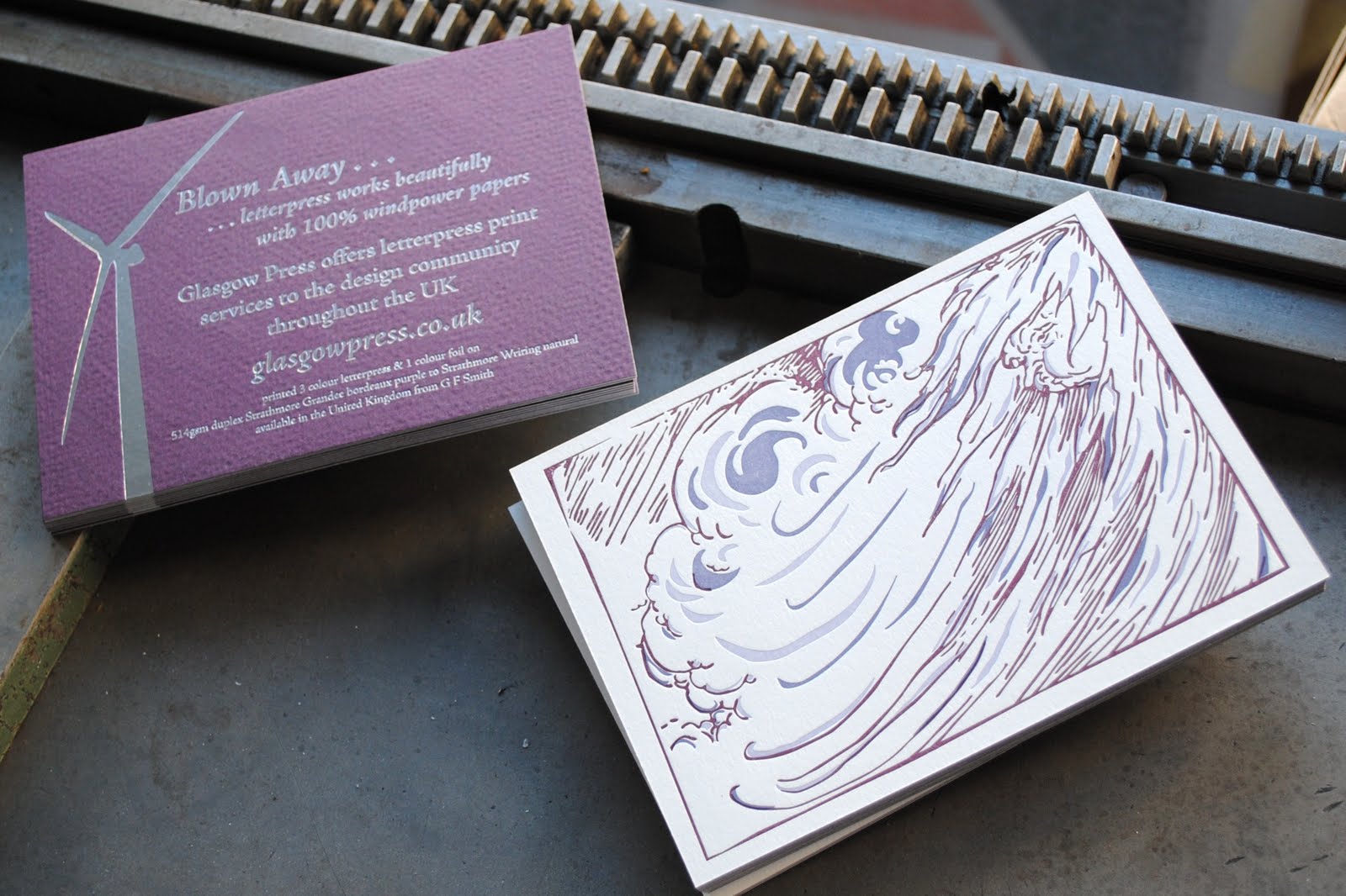
Blown Away . . .

It seems appropriate, as gale force winds rage round our printworks today, to feature a postcard we printed showing how good letterpress print and hotfoil looks on 100% windpower papers.
The paper is a fusion of Strathmore Grandee (bordeaux purple) and Strathmore Writing (natural), both available in the UK from GF Smith, bonded to a plump weight of 514gsm.
The gusty old North Wind is blowing with all his might in three colours of ink and on the reverse a silvery smooth foil shows how well suited these papers are to our fine craft.

Wednesday, 7 September 2011

Top of the Class

This invitation to attend a reception at Morrison's Academy reflects the fine tradition and exceptional qualities that makes Morrison's one of the leading independent schools in the UK.
Designed by Kayak, the card is a duplex board at 540gsm weight. The bright white side is letterpress printed deep red ink on the white side. After some research, we were able to source a perfect shade of foil for the bokhara red side to incorporate the school colours.