Monday, 24 December 2012

A Partridge in a Pear Tree


Christmas cards are fun to print and a sight better than just about anything you can get in the shops. This year we enjoyed printing this clever Christmas card from Glad Creative. The motifs of the partridge and the pear are cleverly blended in a fresh green letterpress print on Materica Gesso 360gsm.
Have a great Christmas season and we look forward to more exciting letterpress printing with you in the new year! 


Tuesday, 11 December 2012

Foil, Emboss & Letterpress Print

Thanks to Ramsay Macfarlane for photographs of a stunning business card he designed and we printed.
The pictures show some nice detail of the beauty of Colorplan by GF Smith which is available in over 50 colours and a wide range of embossings and weights.
This card is a fusing of two boards at 270gsm, making a substantial 540gsm weight, which allows a firm impression on both sides of the card.
One of the sheets is Cobalt and the other is Pristine White. On the Cobalt side, a Wire emboss has been applied which highlights the contrast between the textured board and the smooth white foil. 
The reverse of the business card is letterpress printed in black and a cobalt ink, mixed to match the cobalt side perfectly and is complete with a blind impression of the practice logo.


Friday, 7 December 2012

Behind the Scenes at Scottish Ballet

Christmas wouldn't complete without a night at the Ballet - hope you've got tickets for The Nutcracker, or whatever glittering performance is at your ballet company, wherever you are in the world.
Earlier this year, we letterpress printed a lovely invitation for a special event at Scottish Ballet. Designer Eve McConnachie shares some thoughts on the card, which we letterpress printed in gold ink on a weighty Colorplan Natural 540gsm.
"The invitation is for an event to introduce Scottish Ballet’s new Artistic Director Christopher Hampson. The event theme is ‘Behind the Scenes at Scottish Ballet’ and offers attendees a rare opportunity to see inside the Company’s headquarters at Tramway. The invitation references this theme with the gold geometric pattern representing our building’s distinctive exterior http://www.scottishballet.co.uk/the-company/how-to-find-us.html "

Wednesday, 28 November 2012

Lets

Designer, Richard Hewitt, asked us to source a purple foil to complement Colorplan Amethyst duplexed to Bright White for this beautiful business card for Liverpool Student Lets.
We found an excellent metallic foil which worked really well; logo to the Amethyst side and text to the Bright White.
The foil glints subtly on the dense colour of the card, making it attractive and very memorable.

Thursday, 15 November 2012

Light Blue Storm

 Many thanks to Storm Creative for an insight into the design thinking behind this amazing business card.

"We designed these business cards as part of a total re-brand for our client, Light Blue. We wanted to better reflect Light Blue’s service, which is to provide simple investment advice for high-net-worth individuals with complex lives. The business cards needed to fit in seamlessly with the lifestyle of a typical Light Blue client. As the business cards are their main sales tool and the only piece of collateral the client receives, they must act as a constant reminder of the quality and simplicity of Light Blue’s service. Therefore, we chose a thick, triplexed card from a high quality stock, letterpressed with hot foils and premium inks for a very tactile finish. The middle light blue layer is a subtle nod to the company name and brand."

As they say, the business card can be the "main sales tool" of a company. At Glasgow Press, we recognise this and will give full care and attention to maintain the highest standards of quality in print production. The cards are letterpress printed and hotfoiled on our Heidelberg platens on GF Smith's Colorplan triplex stock 1050gsm, Dark grey / Turquoise / White Frost.

Tuesday, 6 November 2012

Scottish Artists Manifesto

Thank you to graphic designer, James McNaught, for sharing this insight to the thinking behind this wonderful design, letterpress printed on our Heidelberg platen

This project was the result of a commission to design postcards to display a specially written poem written by Don Paterson, OBE. The poem, which enshrines creativity and the arts, will serve as a manifesto for Scottish artists. Many leading artists have already signed these cards, which will be sent to the Scottish Parliament as part of a campaign to improve the way in which Creative Scotland – the funding body for Scottish arts – is operated. It's been a real privilege to be able to contribute, even in a small way, to this movement.

As far as the design is concerned, I wanted to keep it simple and to the point (the words themselves have such beauty and power that I just wanted to let them shine!) I force justified the text and replaced line breaks with a simple decorative element to give me more control over the composition, and afford the design an authoritative, almost biblical quality. To give it a more human feel, it was letterpress printed on textured, creamy-white card (360gsm Materica Gesso) with metallic gold ink (Pantone 271C).


View James' portolio here:

Tuesday, 30 October 2012

Bruto

Bruto is an interdisciplinary design studio and branding consultancy based in South Sweden and run by Graphic Designer/Art Director Eduardo Mateos.

The studio's own business cards are a subtle and sophisticated blend of fibrous Colorplan stock from GF Smith. We letterpress printed a crisp black ink to the pristine white board which features a soft blind deboss on the ebony side; making the mark beautifully.
This very fine business card firmly whispers volumes about the talent and taste of the designer.
 

Monday, 15 October 2012

Birthday Tribute to a Friend

20120917223834
Many thanks to Tak Ishii and Madoka Kubota who asked us to produce unique birthday greeting cards. These are a lovely combination of Colorplan bright white and satin gold foil.
Tak shares his thoughts behind this splendid gift to his friend.
"This design is dedicated to my friend, Yosuke, for his 30th birthday. He has already used his business cards designed by his architectual firm, but the present design represents his humour through a symbolic golden face, yielding a vivid impression within anyone to whom Yosuke will give a card. The Letterpress by Glasgow Press vitalized our design in an elegant and unique fashion; this is the very memorable present for Yosuke. This specially tailored set of cards, we are sure, will be an incentive for a series of creative architectual works in his 30’s."
20120917223833
20120917223838
20120917223836
20120917223837


Monday, 8 October 2012

Orb

 This is a delightful A6 single card of Colorplan 700gsm weight, duplexed in heavenly azure and white frost. We letterpress printed the front in blue ink with a crisp, deep impression.
Thanks to Orb for this great design and the following design rationale.
"We wanted to send our clients something beautiful as a personal thank you – something for them to remember us by. After seeing some previous letterpress work by Glasgow Press we knew this was the direction to take. The design itself based around our office mantra of making 'Hell Yeah!' moments, highlighting how much of a hands on company we are!"

Wednesday, 3 October 2012

Meet Market

We were invited to give a presentation and display some of our work at the MeetMarket, part of Social Media Week Glasgow. It was great to meet a host of talented people and hear a little about the amazing work that's being produced all around us!

STV Creative asked us to print the invitation for the event. Playing on the meet/meat market association, the choice of board was a blood red Colorplan by GF Smith with a very apt leather emboss, which we letterpress printed in burgundy ink. 
 
Here we are, depicted as prime topside of beef, tender and mouthwatering. Yeah, that'll do. 


Friday, 28 September 2012

kukka

Designer, Rebecca Wilson, of fivefourandahalf, asked us to produce a press pack for kukka. The stock is Colorplan 270gsm Cool Grey. We applied a white foil to the front and diecut each pack, thereafter assembling them with loving care and attention.
Rebecca shares a few words on the design rationale - thank you!
'Israeli-British product designer Rona Meyuchas K. came to me asking if I could design a limited edition press pack to be distributed at the Design Junction event as part of London Design Festival. With very little going into the packs – an 8 page pamphlet and a pine finish branded USB stick – the challenge was to come up with something that ensured the content was presented as more than the sum of its parts. At the same time, with only 60 units, it was tricky to make it look high end yet keep it affordable. Glasgow Press did a beautiful job of die cutting and assembling our sleeves in GFSmith Colorplan Cool Grey, and using a white foil for the kukka logo on the front. The press packs were finished off by attaching a slim red cotton ribbon to the inside back of the sleeves, on to which the magnetic USB sticks were attached, and dropping these in with the 8 page pamphlets. They went down a treat, so thanks to everyone at Glasgow Press who was involved"

Monday, 24 September 2012

Summer Celebration

 As we mark the Autumnal Equinox, it's nice to look back on summertime memories. A treasured  invitation is a lovely way to recall a great evening. Especially on a rainy, blustery September morning!

This invitation was letterpress printed on our Heidelberg platen on a variety of Colorplan sheets - chosen from the 52 colours currently available.
The barbecue was delicious, the swimming was er, exhilarating, the beach bonfire was very welcome.
The party's over, but you can still use the number below for any letterpress enquiries!

Tuesday, 18 September 2012

Kieran Dodds, Photo Journalist

We letterpress printed and diecut wallet enclosures for award winning photo journalist, Kieran Dodds.
The designer, Ed Watt of O Street, worked closely with us on this project and we thank him for the fine photographs he took during the production process.
The chosen stock is Materica 360gsm in Pitch and Terra Rosa from Fedrigoni. This board takes a very nice impression and diecut well too.
The assembled wallets will hold photographs of two of Kieran's recent projects; painting the forth bridge and the bats of kasanka. 

Monday, 10 September 2012

Wedding in Londres

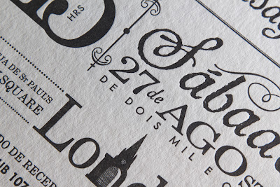
 A delightful wedding invitation from designer/illustrator, Karen Sawrey. Letterpress printed in black ink onto Colorplan Pristine White 540gsm, by GF Smith, the invitation features beautiful typography and whimsical design elements in both English and Spanish.